|
Heat Map Setup |
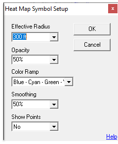
Any point based layer can be configured with a heat map style display. To do this click in the symbol column for that layer in the Layer Settings screen and then click "Use heat map symbol" to display the following setup screen. Heat map layers are only meaningful on layers with a large number of points.
Effective Radius
This setting determines how much area gets colored per each point in the data. This quantity can be specified in feet, miles, or pixels. When pixel distances are used the resulting heat map will appear different at different zoom levels. There is no exact science to selecting the best radius. Ideally this radius should reflect the area that each point "represents". However, it is often determined through trial and error in determining which produces the best looking map.
Opacity
How opaque the heat map layer should appear. Decrease this value to make it more translucent.
Color Ramp
Choose a set of colors to use to represent the varying point densities. The first color listed represents the color assigned to low density areas and the last color listed represents the color for highest densities.
Smoothing
This value affects how the smoothly the colors transition from one to another. Set this to 0% to see crisp boundaries between the colors. Or set it to 100% to see a more seamless transition from one color to the next.
Show Points
Select "Yes" for Think GIS to show a dot at each of the point locations in addition to the heat map coloring.
Example Heat Map Layer
|
Copyright © 2026 WTH Technology |
.png)