|
Heat Map Layer |
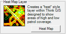
This History tool is designed to make areas with a lot of vehicle activity clearly stand out on the map. As a result, areas having a relatively low amount of vehicle activity can be made more apparent.
To use this tool do the following:
1) Select the Heat Map Report button on the AVL Administrator History tab.

2) Select date and time parameters.
Click on the interactive image below for more information.
3) Select one or more vehicles to query.
Click on the interactive image below for more information.
4) Configure layer location, name, and parameters.
Click on the interactive image below for more information.
5) The layer will automatically be added to the map and will display.
.png)
Notes:
•The layer that displays uses the following colors accordingly:
oWhite = areas with the highest amount of activity
oYellow = medium
oOrange = medium
oRed = low
•The color coding is done on a sliding scale that is automatically adjusted based on the total amount of vehicle activity. So it is impossible to quantify "how much" activity each color represents, other than to say white is the most, red is the least, etc.
•It will be very obvious which roads are most commonly driven and which ones are not. Any point locations with higher intensity then their surrounding areas are usually locations where the vehicle made a stop or commonly made stops.
•Heat Map Layer vs Heat Map Image: The Heat Map Layer described on this page downloads the data for the report from the server and dynamically renders it on the Think GIS display at any zoom level. The Heat Map Image report, however, generates its report on the server and a resulting static image is downloaded. The Layer option is best for interacting with the data and view it at varying zoom levels. The Image option is best for working with large amounts of historic data that take a lot time or memory to download.
|
Copyright © 2025 |